Improving UX and conversion
Canadian Energy Strategies Inc.
About
Canadian Energy Strategies, or CESi for short, offers valuable insights into volatile energy markets and expert guidance on government incentive and rebate programs for corporations.
Situation
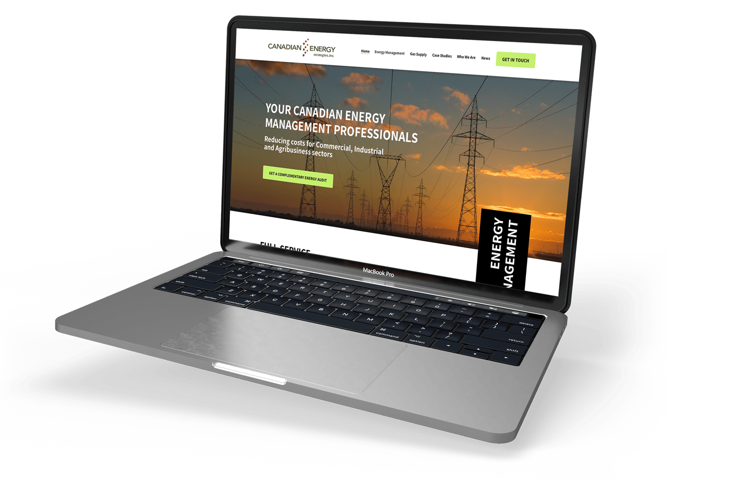
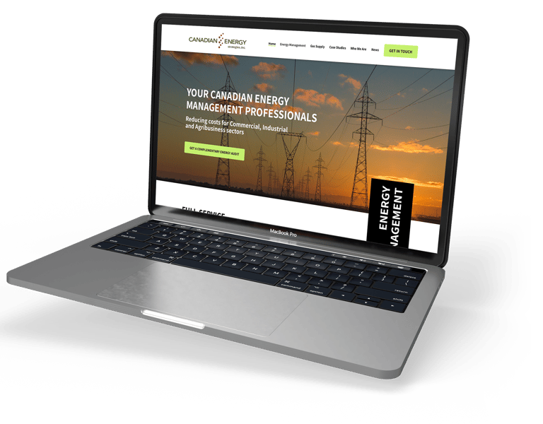
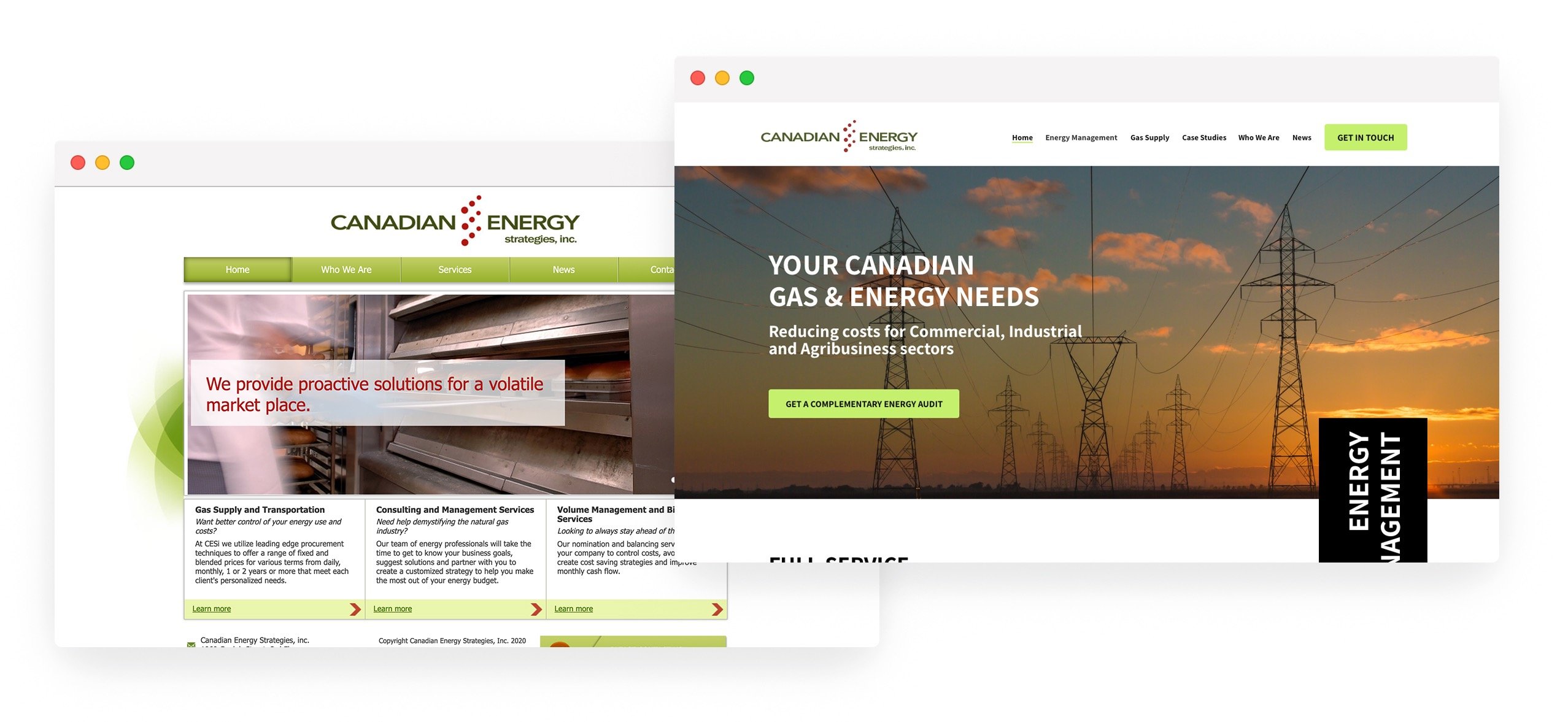
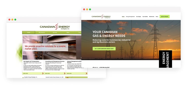
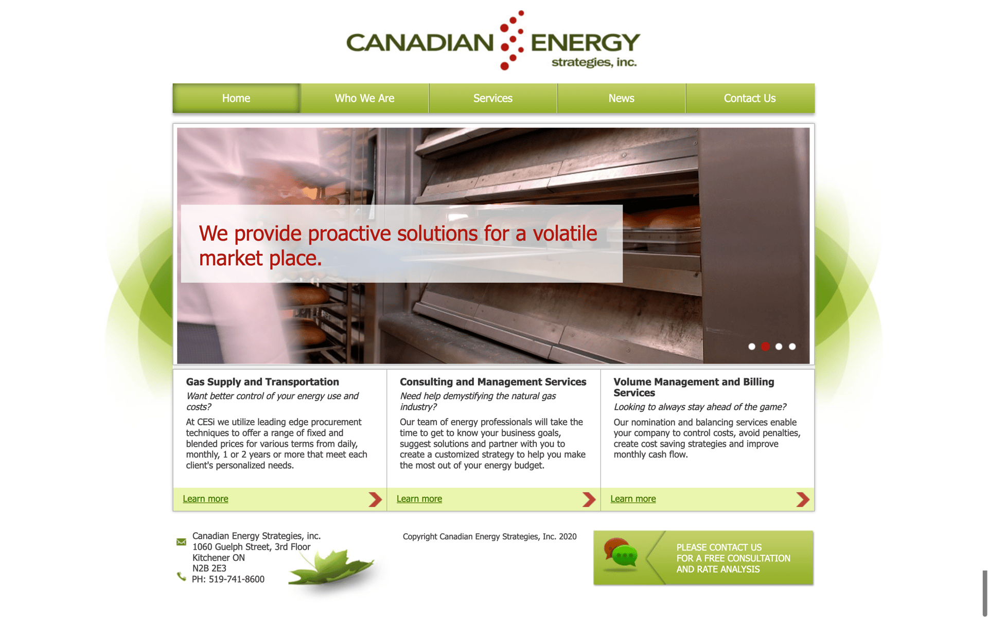
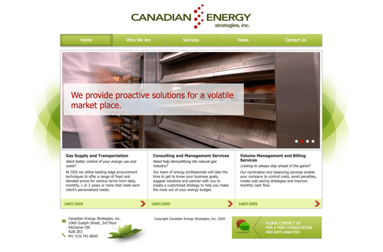
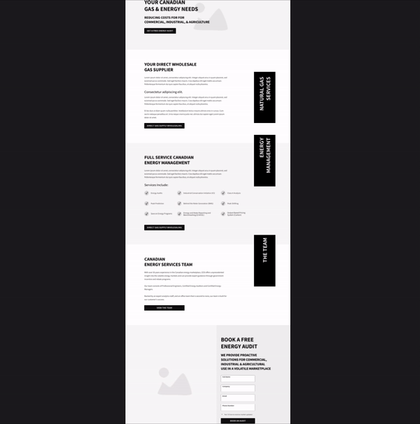
The company had a website that looked outdated and lacked optimization. It was essential for their target audience—comprising the commercial, industrial, and agri-business sectors—to perceive them as a trustworthy and professional organization.
Objectives
To revitalize and restructure the website for improved UX, and conversion rates. Everything was open for revision—except for their logotype.
This work was carried out at a digital marketing agency, where I served as the creative director and primary contributor, leading efforts in UX research, UI design, branding, and overall design.
First steps
Assessing
After meeting with the client, it was clear that the target audience consisted of educated individuals who know exactly what they are seeking when visiting the site.
To better understand the market and address any gaps, a competitor analysis was conducted.
Understanding
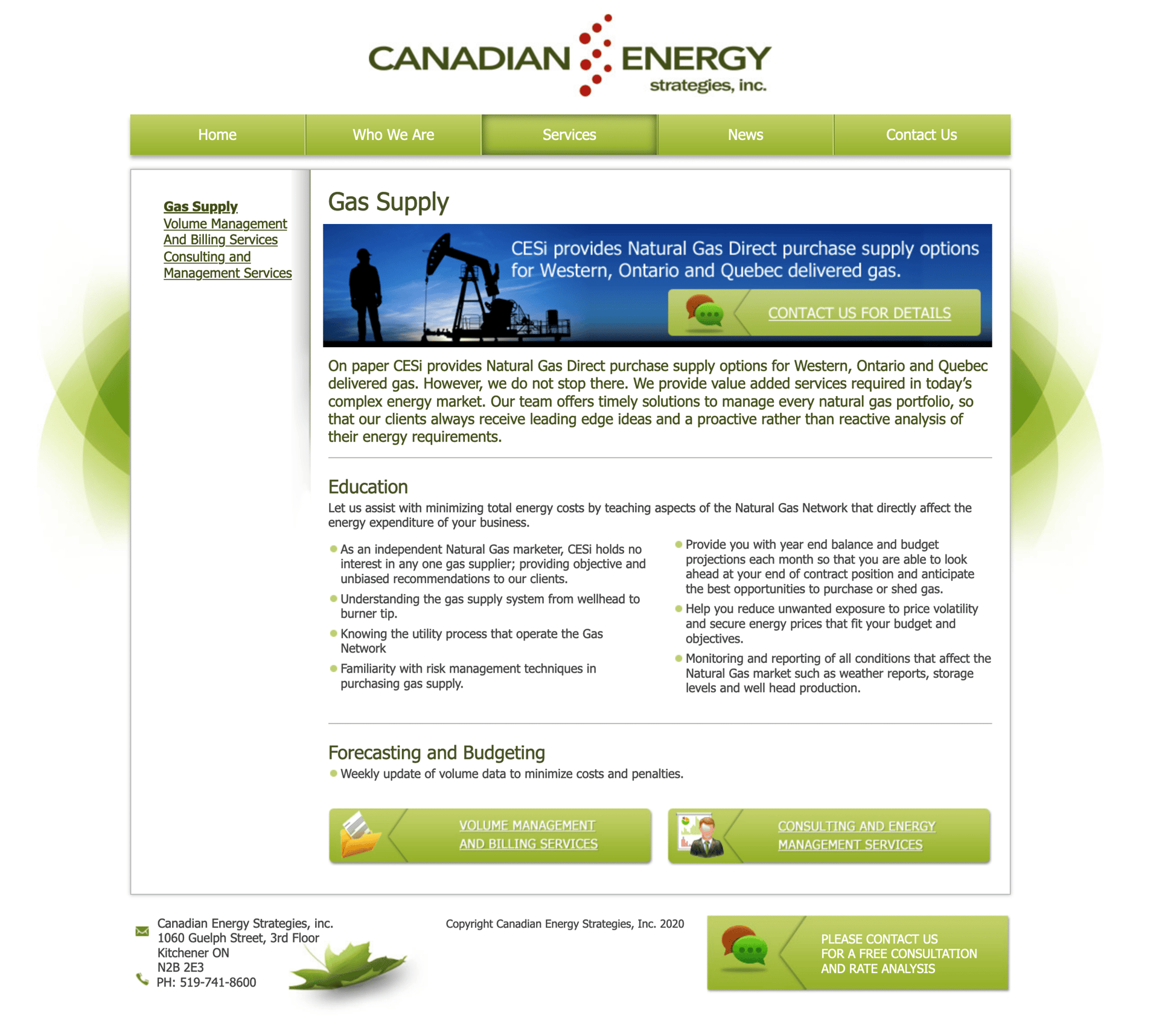
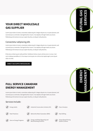
The first challenge arose when trying to compile and understand the full range of services offered by the client. The outdated website presented a list of services that fell into three different categories: Gas Supply, Volume Management, and Consulting & Management.
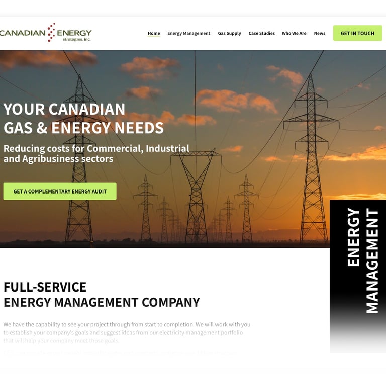
Positioning
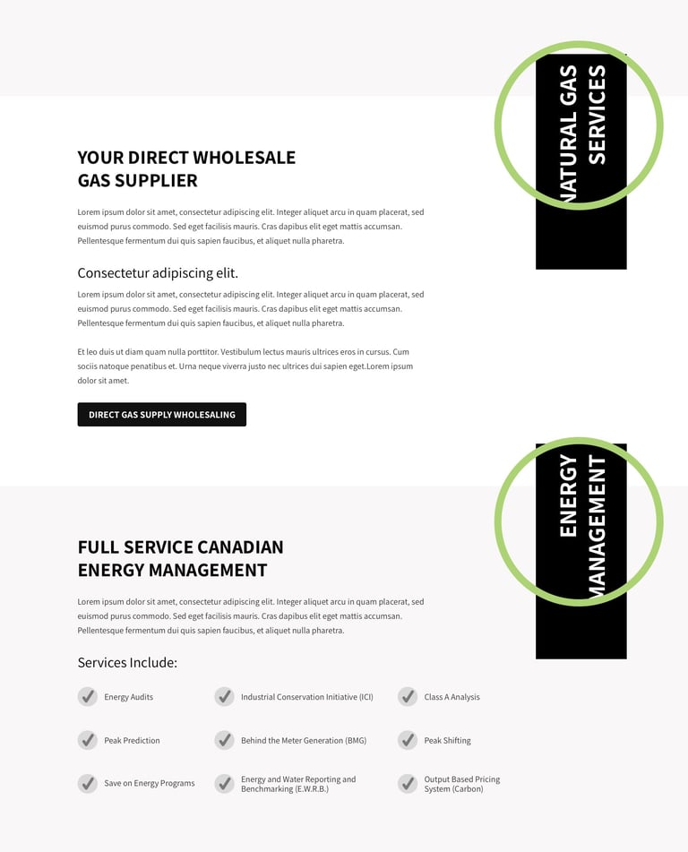
Upon further examination, it became evident that CESi actually provided a broad array of services that could be simplified into two main categories: Gas Management and Electricity Management.

A service within a service
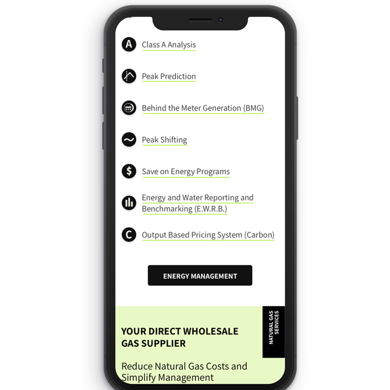
Once the service categories were established, the next step was to organize the list of sub-services within each category. For instance, services such as Peak Prediction and Class "A" Analysis are services under Energy Management.
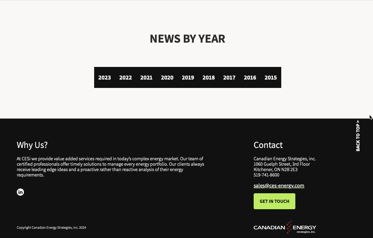
Navigation & Sections
Each service section was overly text-heavy, making it difficult to present the offerings in a simple and clear manner.
To avoid visual clutter, I limited the use of titles and subtitles, designating the main section descriptor (H1) as a dynamic element that also served as a navigational tool. These dynamic elements would shift up and down as the user scrolled, giving them a sense of understanding over their position on the page.
This approach clearly delineates where each category or section begins and ends, mitigating user confusion.
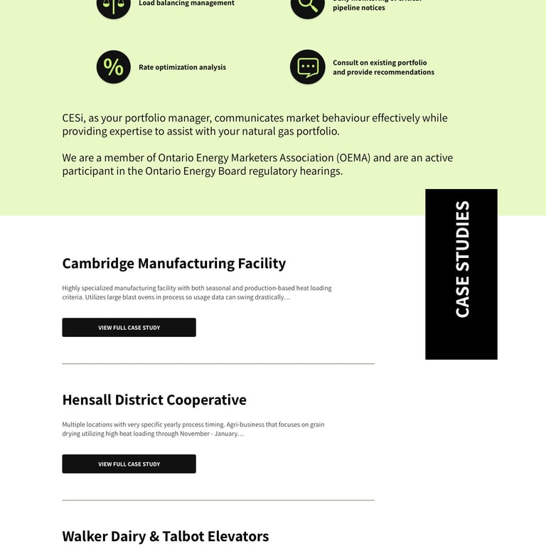
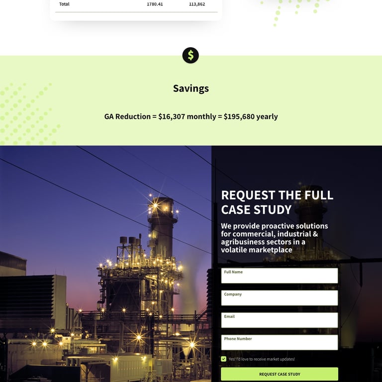
Value & perception
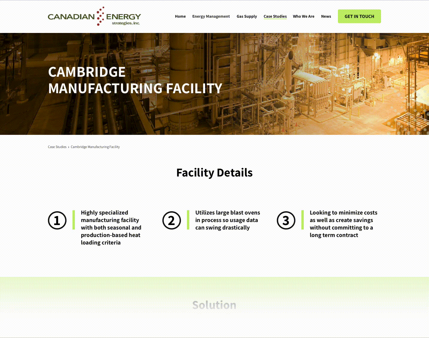
Case Studies
To strengthen CESi's value proposition and enhance brand perception, a case study section was developed by selecting key information from Excel sheets and PDFs filled with tables, charts, and raw data.
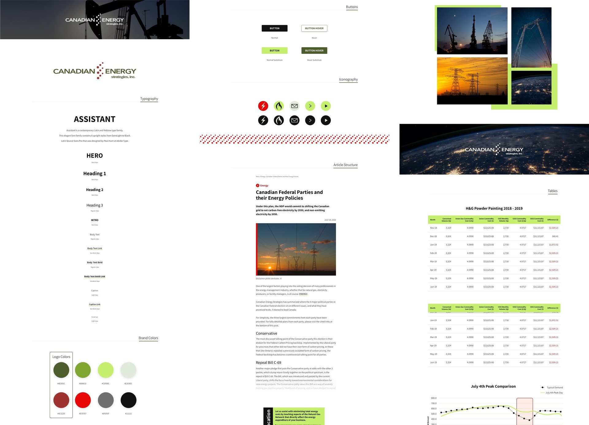
Visual Identity
Drawing solely from their existing website, which lacked brand and design guidelines, I revamped their visual identity and established a solid foundation for future development.
Iconography and imagery styles were established, along with clearly defined color palettes and typography styles.


Gallery
More on UX / Web design
Nasdaq Corporate Solutions UX
Integrating three separate web environments with an optimized structure and navigation


International Gem Society Advice Portal
Creating a new website section devoted entirely to the diamond buying process


More Online & Archived Website Projects
All showcased work is either owned by me, C. Balderas, or by the respective clients and employers for whom the designs or solutions were developed.
cbalderas © 2026