Building coherence and consistency


Explorance Inc.
About
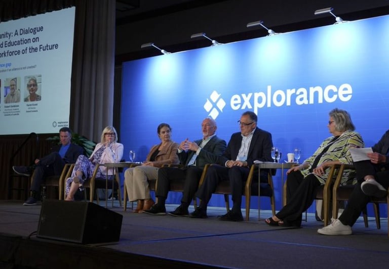
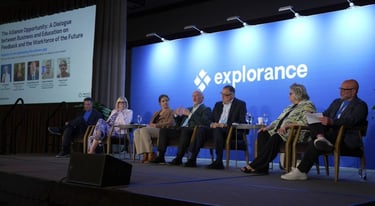
Explorance, a company valued at 50M+, is a provider of people insight solutions that empowers organizations to make informed decisions by assessing the needs, expectations, skills, knowledge, and competencies of students and employees.
Objectives
I joined the company as head brand and marketing designer to drive coherence and consistency, ultimately elevating the brand to create awareness and drive engagement.
Challenges
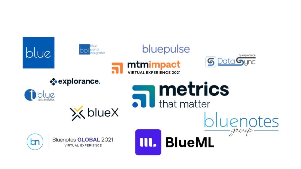
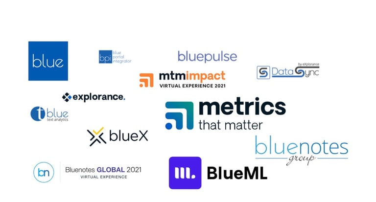
The brand structure was nearly non-existent. Some products were developed in-house, while others were acquired over the years. The company had a varied collection of logotypes, colors, and styles that undermined efforts to build brand awareness, recognition, and equity.
First steps
Assessing
The first step was to evaluate and identify the different visual styles employed throughout the company, including logos, icons, typography and their applications.
Stabilizing
The next logical step was to stabilize the situation by embracing the predominant style, thereby creating a cohesive and unified look and feel upon which further development could be built.
Planning
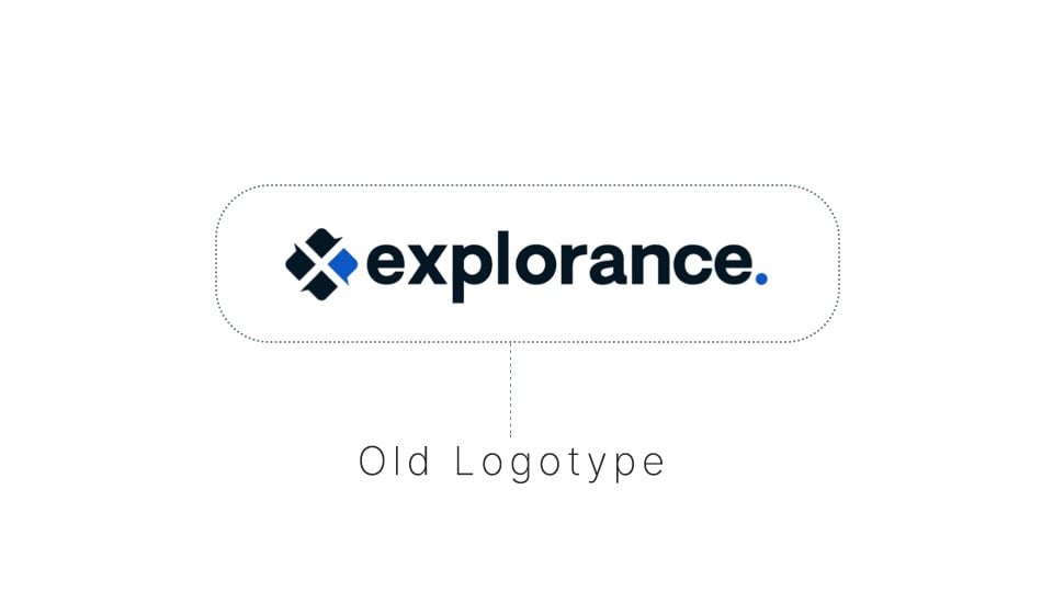
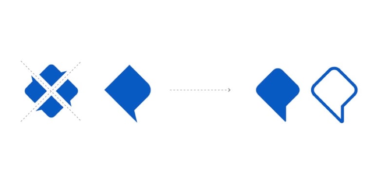
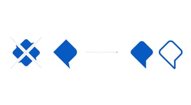
With no design system in place, I started using the logotype symbol, which few recognized as four speech bubbles—an aspect I wanted to highlight. However, its sharp angles and square design posed challenges.

Revitalizing
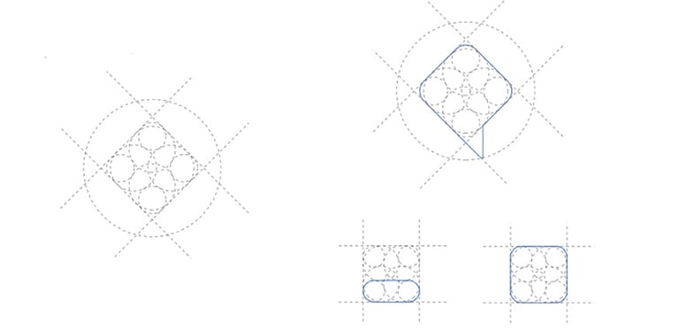
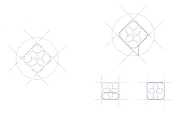
The Grid
A grid was created to ensure balance, structure, and consistency throughout the brand. More than just a grid, it serves as a comprehensive system that unifies all brand elements.
The Symbol
By softening the sharp edges through the grid, we achieved a more fluid and approachable shape that can now be effectively utilized across all brand materials. More over, it now resembled a speech bubble. Something important for a company specializing in feedback software
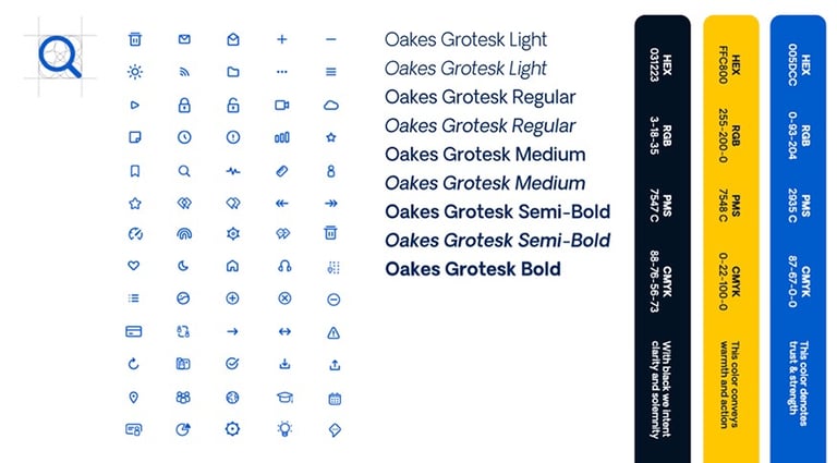
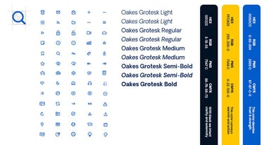
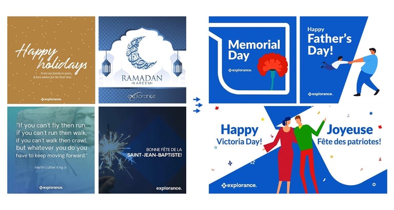
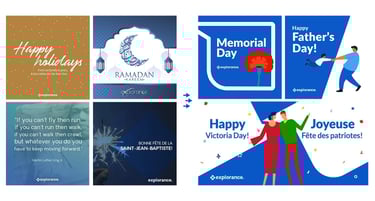
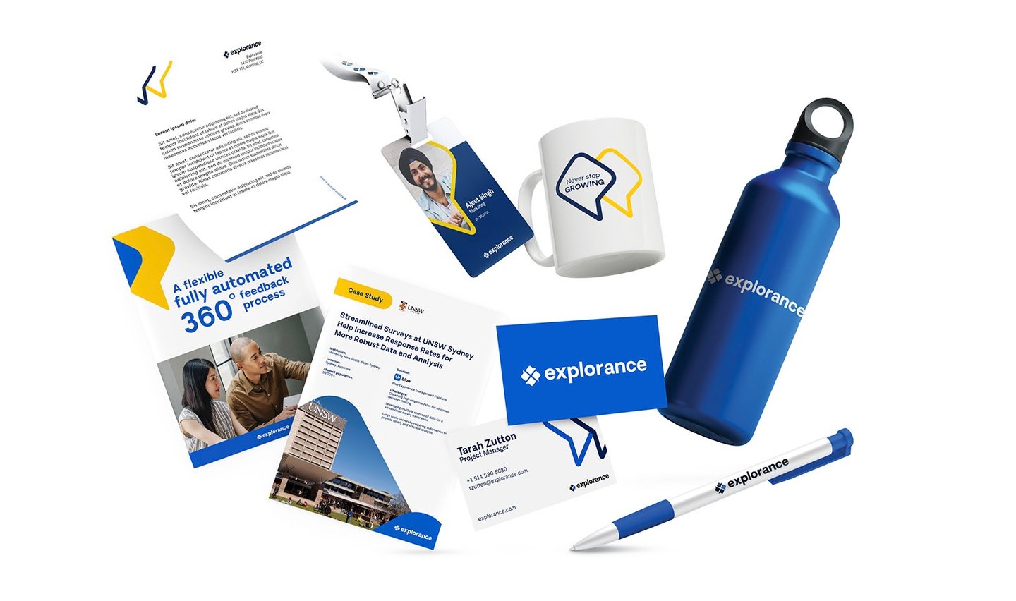
Utilizing the grid, I crafted a distinctive iconography style for internal and in-product use. I standardized the typography, revitalized the brand's historical blue color, and introduced a fresh palette of new colors.
Iconography, Typography, etc.
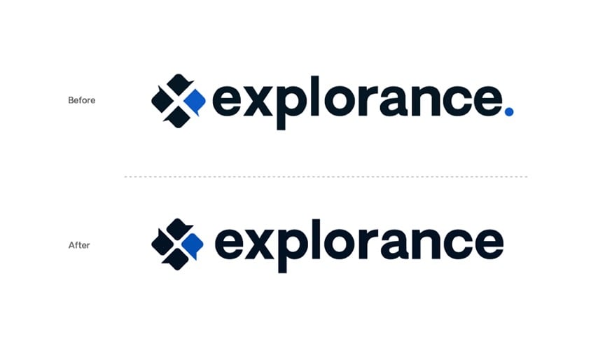
The Logo
With these changes, I refined the logo by adjusting the kerning, updating the symbol, and removing the blue dot, which held no meaningful significance.

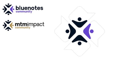
The Community Logos
The grid and design system resulting from this revamp enabled a seamless integration of other branded elements, including communities like Explorance Bluenotes and MTM Impact.
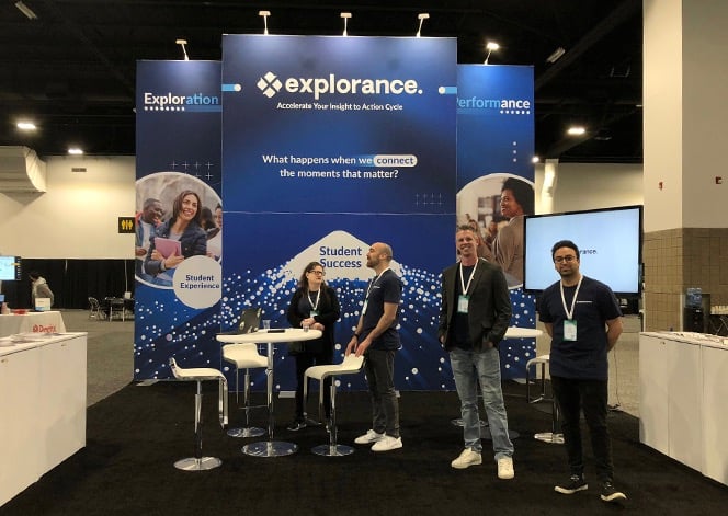
Today, the company has significantly evolved. Undoubtedly, my work was pivotal in reframing the brand and served as a cornerstone for its ongoing development.
More on branding & strategy
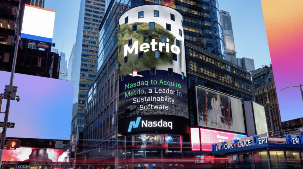
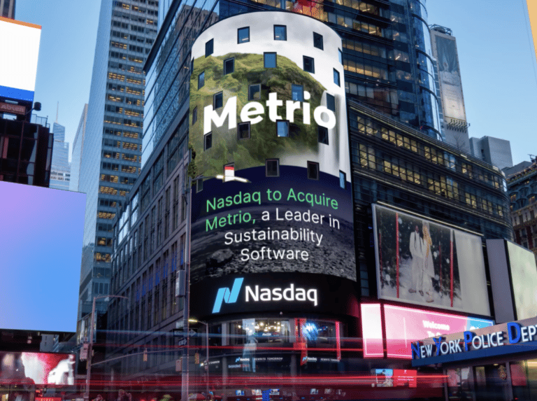
Nasdaq Metrio & ESG Solutions
A diverse range of strategic design and branding projects executed for Nasdaq

Trident Naturopathic Clinic
Building brand in the limited market of men's holistic health


More Branding Projects for Individuals and Small Companies
Also related


Canadian Energy Strategies Site
Complete redesign of a leading energy and gas management advisory firm's website
All showcased work is either owned by me, C. Balderas, or by the respective clients and employers for whom the designs or solutions were developed.
cbalderas © 2026